Networks with MlFinLab: Minimum Spanning Tree (MST)
By Sofia Uri Lee
Join the Reading Group and Community: Stay up to date with the latest developments in Financial Machine Learning!
Network analysis can provide interesting insights into the dynamics of the market, and the continually changing behaviour. A Minimum Spanning Tree (MST) is a useful method of analyzing complex networks, for aspects such as risk management, portfolio design, and trading strategies. For example, Onnela et al. (2003) notices that the optimal Markowitz portfolio is found at the outskirts of the tree [4]. Analysing the Tree structure, as a representation of the market, can give us an idea about the stability and state of the market.
A Minimum Spanning Tree (MST) is a graph consisting of the fewest number of edges needed for all nodes to be connected by some path – where the combination of edge weights sum to the smallest total possible.
MST strongly shrinks during a stock crisis [2]. Properties such as skewness are positive during times of market crises (such as 1987, early 2000’s and 2008) and skewness and kurtosis have stabilised after 2000’s [1]. Analysing the Tree structure, as a representation of the market, can give us an idea about the stability and state of the market and predict how volatility shocks will propagate through a network.
MST Visualisations
Visualisations are created using Plotly’s Dash, which creates a mini Flask server to serve the frontend components. This section gives examples of how to create and run the MST visualisations, and examples of optional functionality such as adding colours to represent industry and node size to represent, for example market cap.
Example Code Snippet
Given a dataframe of log returns, you can call generate_mst_server to generate a MST server.
import pandas as pd
import numpy as np

# Import Visualisations method
from mlfinlab.networks.visualisations import generate_mst_server

# Import Data
input_dataframe = pd.read_csv('../Sample-Data/stock_prices.csv')

# Calculate log returns
input_dataframe = np.log(input_dataframe).diff()

# Remove first row of NaNs
log_return_df = input_dataframe.iloc[1:]

# Create and run the server
server = generate_mst_server(log_return_df)
server.run_server()
To create and run the server in the Jupyter notebook, pass in the parameter jupyter=True and call run_server with the parameter mode as ‘inline’, ‘external’ or ‘jupyterlab’.
server = generate_mst_server(log_return_df, jupyter=True)
server.run_server(mode='inline')
The inline mode allows you to interact with the Dash interface within a cell of Jupyter notebook.
MST Layouts
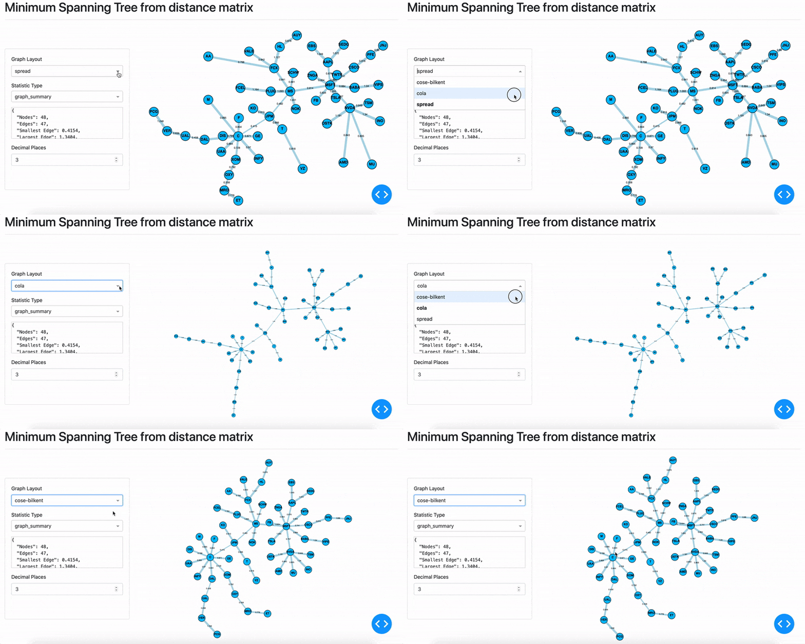
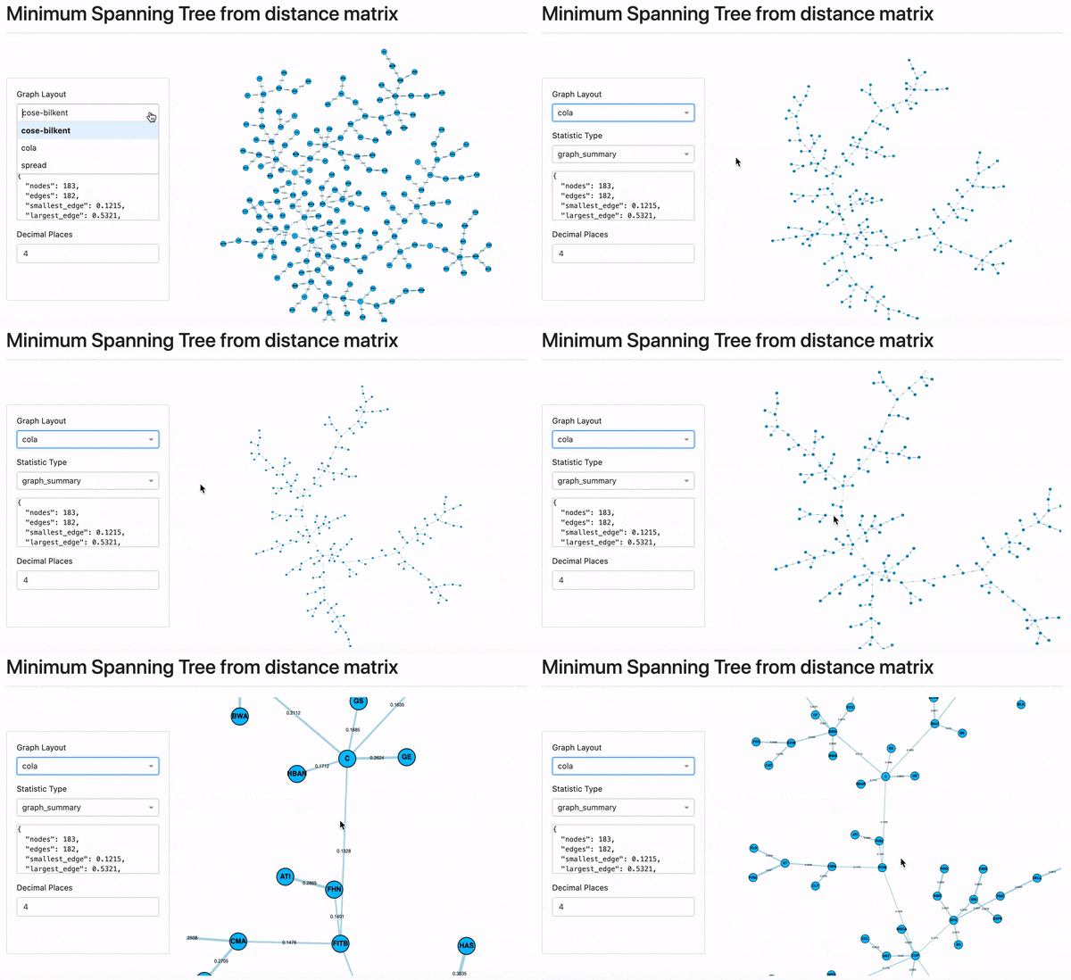
On the side panel, the top dropdown menu contains three different layouts designed to layout the MST. These are namely cose-bilkent, cola and spread, selected as optimal layouts to view the MST. Cola and spread are physics simulation based, and cose-bilkent is a spring embedder layout. These are external layouts, and more information can be found on the Dash documentation.
Adding Industry Groups
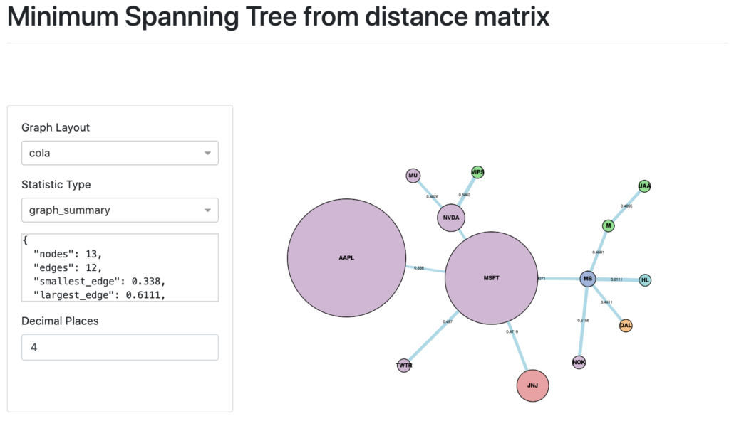
According to Marti et al., the “MST provides a taxonomy which is well compatible with the sector classification provided by an outside institution” [2] An example of 13 stocks from August 15th 2020 until August 10th 2020 for daily closing prices is shown below.
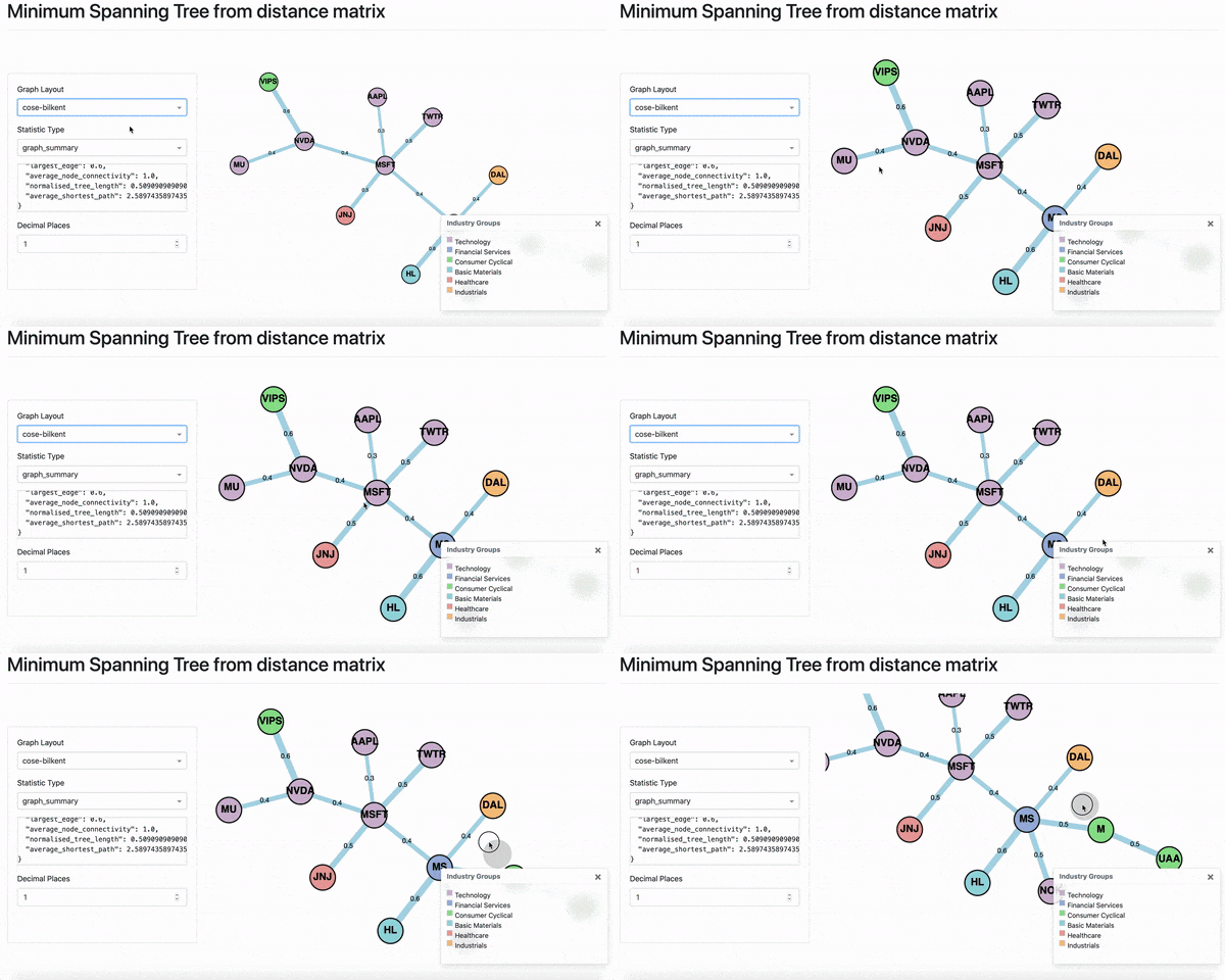
The colours correspond to the Industry Groups legend. However, you can add different categories such as instrument type. The legend generates the colours and the matching categories supplied. Colours must be set by calling `set_node_groups` on class `MST` before the `MST` object is passed to the `DashGraph` class.
Adding Market Cap
To add the market cap, we call `set_node_size()` in the `MST` class before passing it to the `Dash Graph`. The market cap is a list corresponding to the index of the original dataframe. The market cap supplied below is measured in billions, at the time of writing (24th August 2020).
MST Statistics
Analysing the MST for topological features such as centrality, node and edge strength and normalised tree length, can be used to indicate the state of the market and understand changes over time. For example, properties such as a rising normalized tree length over the last 30 years [1], indicates growing correlation between stock returns. The statistics on the left panel of the UI, can be used for analysing the properties of the MST.
Average Node Connectivity
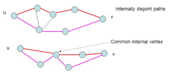
Average Node Connectivity is defined as “the maximum number of internally disjoint paths connecting” given a pair of vertices for all pairs in the graph [3]. Two paths u, v are internally disjoint if they don’t share a common internal vertex.
In the example above, the value is 1, since for an MST there are no loops. However, Average Node Connectivity is useful for understanding the properties of PMFG or other types of graphs.
Normalised Tree Length
Normalised Tree Length is positively correlated with stock market returns [1] and negatively correlated with tail risk and return volatility [1]. Thus, Normalised Tree Length is perhaps one of the most important statistics to analyse which financial instruments increase market returns but decrease tail risk and return volatility.
\begin{aligned}L(t) = \frac{1}{N-1} \sum_{d_{t}^{i,j} \in T^{t}} d_{t}^{i,j}\end{aligned}
Normalised Tree length at time t, is the sum of all edges in the distance matrix divided by the number of edges in the MST. It is defined as follows [4] :
Where L(t) is the Normalised Tree length, t is the time at which the tree is constructed, N-1 is the number of edges in the MST and D is the distance matrix.
Average Shortest Path
The Shortest Path of two nodes i and j is defined as the path which gives the minimum possible sum of the weights of the edges. The average shortest path is the average of the shortest paths for every combination of nodes in the graph. This gives an indication of how closely connected the nodes are in the graph overall.
Average Degree Connectivity
The average degree connectivity is the “average nearest neighbor degree of nodes with degree k“. The algorithm is essentially the same as the k-nearest neighbours algorithm, and returns a dictionary of degree k and value of the average connectivity. It is defined as [5]:
\begin{aligned}k_{nn,i}^{w} = \frac{1}{s_{i}} \sum_{j \in N(i)} w_{i,j} k_{j}\end{aligned}
Where si is the weighted degree of node i, wij is the weight of the edge that links i and j, and N(i) are the neighbors of node i.
Average Neighbour Degree
The Average Neighbour Degree calculates the average number of neighbours of each node, weighted by the edge weight value.
Betweenness Centrality
Betweenness Centrality measures the “fraction of the shortest paths passing through a vertex” [6]. In a social network, a node with a high betweenness centrality value suggests the node is playing a “bridge spanning” role [7].
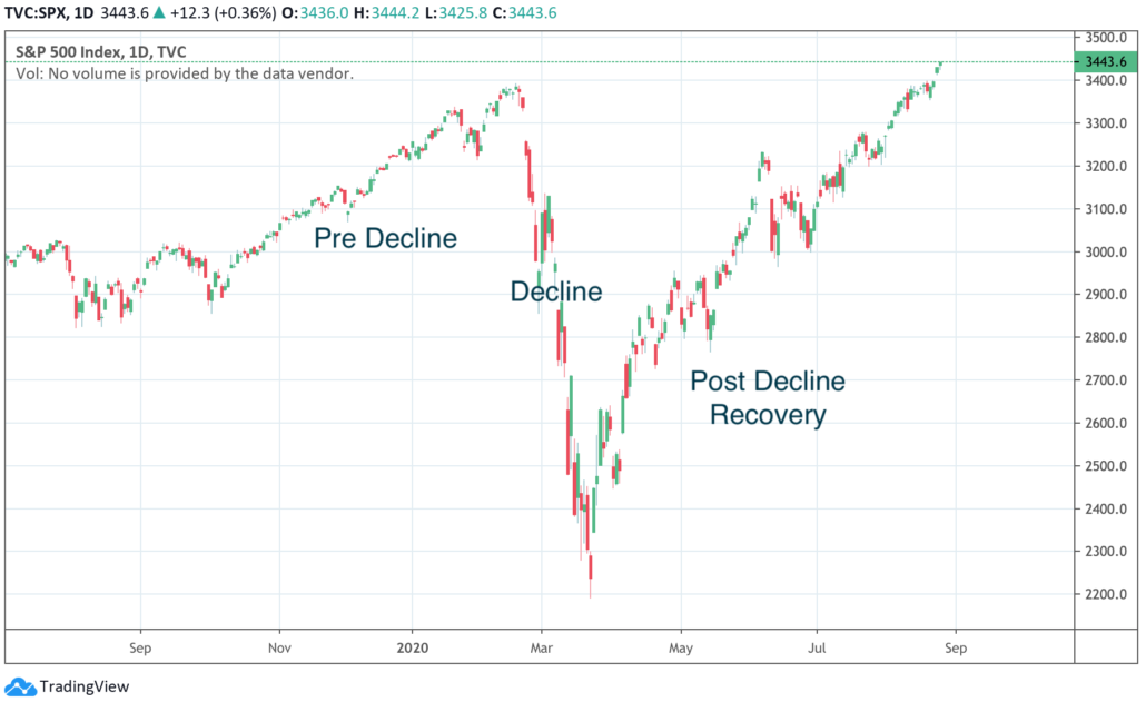
Covid Effect on MST
Now we can explore the effect of COVID-19 on the MST of 48 stocks. The stock data is based on daily closing prices and retrieved from Yahoo Finance (https://finance.yahoo.com).
The data is split into 3 periods:
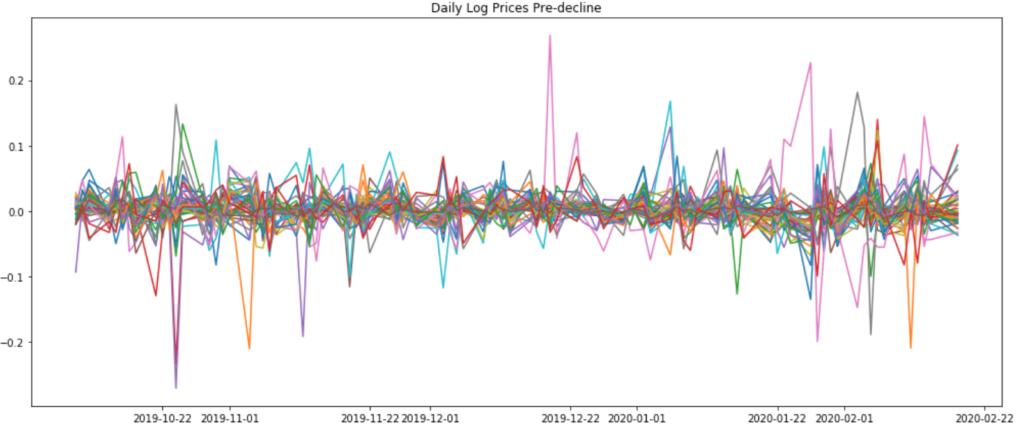
- 9th October 2019 until 18th February 2020
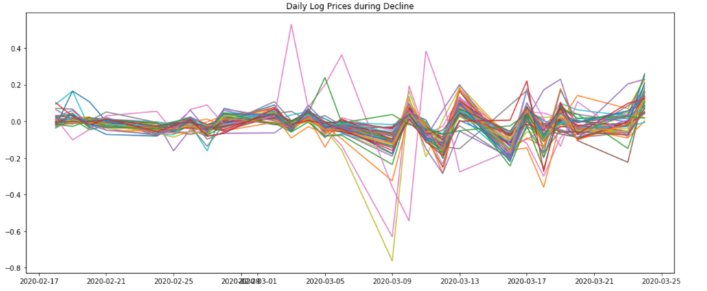
- 18th February until the 24th of March 2020
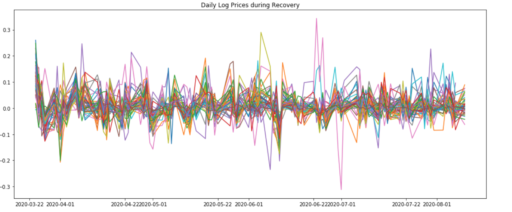
- 24th March 2020 until 13th August 2020
The following graphs show the Daily Log Prices during the pre-decline, decline and post-decline recovery periods.
Analysis based on Distance Matrix
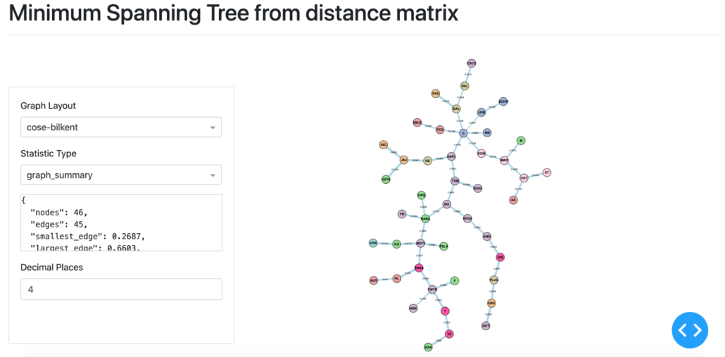
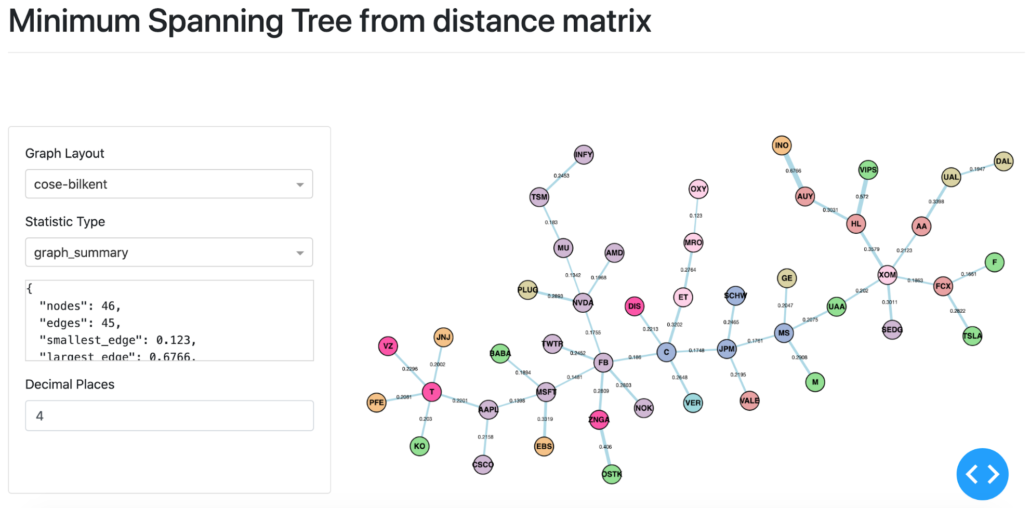
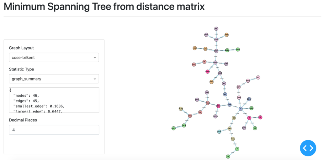
Pre-Decline MST based on distance matrix.
The above shows the MST based on the distance matrix during the decline period. Facebook (FB) changes from degree 1 in the pre-decline period, to degree 6 during the decline, and back to degree 1 during the post-decline recovery period. JPMorgan Chase (JPM) and MS (Morgan Stanley) become a part of the backbone of the MST during the decline period. Both JPM and MS become a connecting node in the post-decline recovery period, acting as bridges between the major branches in the MST.
The general trend throughout the periods is that the distances between the nodes in the same category decreased during the Decline period, and did not recover to the pre-decline levels. This is the case for example, for the financial sector stocks. Another example is the sector group Energy (in a light pink colour). A similar trend occurs amongst Technology stocks (shown in light purple).
Analysis of Statistics
- Statistic Type
- Normalised Tree Lenght
- Average Shortest Path
- Pre-decline
- 0.504
- 6.224
- Decline
- 0.250
- 5.533
- Post-decline
- 0.380
- 6.293
- Degree
- 1
- 2
- 3
- 4
- 5
- 6
- Pre-decline
- 3.05
- 2.536
- 2.542
- 2.167
- –
- 2.167
- Decline
- 3.885
- 2.722
- 2.778
- 2.5
- 2.133
- 2.833
- Post-decline
- 3.545
- 2.654
- 2.467
- 2.25
- 2.2
- 2.167
Both Normalised Tree Length and Average Shortest Path decrease during the Decline period, suggesting a shrinkage of the overall MST. The second table shows the Average Degree Connectivity (rounded to 3 decimal places). Degrees 1, 2, 3, 4 and 6 show a change during decline but returns closer to pre-decline levels. The central node with 6 degrees changes from C (Citigroup) to FB (Facebook) back to C (Citigroup).
It is clear that the Covid-19 related decline has shrunk the MST. The market (based on the above stocks) has become increasingly correlated post-decline compared to pre-decline, despite much of the prices of stocks having recovered to pre-decline levels. The post-decline recovery market has also become more volatile (as shown by the log return figure for this period). Investors’ preference for “safer” assets such as technology stocks (perceived as generally more pandemic resilient), was not obvious by looking at the MST.
Prim’s vs. Kruskal’s in Larger Dataset
According to Huang et al. [8], Prim’s has a time complexity of O(n) and Kruskal’s has a time complexity of O(n2). For more than 100 stocks in a dataset to build an MST, Prim’s was recommended for time efficiency. To test the difference between Prim’s and Kruskal’s, one year’s worth of data for 183 stocks for daily closing prices was used to generate the MST.
Due to the nature of the respective algorithms, Prim’s is recommended for sample sizes larger than 100, and Kruskal’s for small sample sizes or when space complexity is more important (Huang et al. 2009).
Running the MST constructor repeatedly showed that Prim’s was on average around 40ms quicker than Kruskal’s per loop. For 20 consecutive runs, Kruskal’s took 11.9 s with 738 ms per loop and Prim’s took 10.9 s with 1.05 s per loop. This was consistent with the hypothesis in the work of Huang et al. [8], where Prim’s outperforms Kruskal’s in Time Complexity when the sample sizes were larger than 100 nodes.
Limitations
The main limitation of MST is the instability which stems from the input data (correlation based matrices). Clusters from the MST are known to be unstable and large changes can occur even with small changes in the data input. A variety of different input data forms have been proposed to address this, as well as other network methods such as PMFG (Planar Maximally Filtered Graph), DST (based on dynamic correlation), or ALMST (Average Linkage MST). However, MST and its features continue to serve as a useful tool to analyse complex networks.
Conclusion
The blog post reviewed how to generate MST visualisations using DashGraph and MST classes. For example, how to add colours based on industry group and add node sizes to indicate market cap. The MST Dash interface allows for interaction with the graphs, as well as different layouts (cose-bilkent, cola and spread) to better view the MST. The blog post reviewed the statistics in the left panel, with an emphasis on the Normalised Tree Length statistic, which is correlated with market returns and negatively correlated with tail risk and returns volatility [1]. The statistics can be used to analyse the MST and its properties across different market states.
An analysis of MST’s during the Covid-related market decline and recovery was done, by splitting the period into pre-decline, decline and post-decline recovery periods. During the decline, the MST shrunk, as is expected during crises [2]. Prim’s was faster than Kruskal’s for a larger dataset of 183 stocks, as expected since the dataset exceeded a 100 nodes [8].
References
- Huang, Wei-Qiang, et al. “Dynamic asset trees in the US stock market: Structure variation and market phenomena.” Chaos, Solitons & Fractals 94 (2017): 44-53.
- Marti, Gautier, et al. “A review of two decades of correlations, hierarchies, networks and clustering in financial markets.” arXiv preprint arXiv:1703.00485 (2017).
- Beineke, Lowell W., Ortrud R. Oellermann, and Raymond E. Pippert. “The average connectivity of a graph.” Discrete mathematics 252.1-3 (2002): 31-45.
- Onnela, J-P., et al. “Dynamics of market correlations: Taxonomy and portfolio analysis.” Physical Review E 68.5 (2003): 056110.
- Barrat, Alain, et al. “The architecture of complex weighted networks.” Proceedings of the national academy of sciences 101.11 (2004): 3747-3752.
- Jia, Yuntao, et al. “Edge v. node parallelism for graph centrality metrics.” GPU Computing Gems Jade Edition. Morgan Kaufmann, 2012. 15-28.
- Hansen, Derek, Ben Shneiderman, and Marc A. Smith. Analyzing social media networks with NodeXL: Insights from a connected world. Morgan Kaufmann, 2010.
- Huang, Feixue, Pengfei Gao, and Yu Wang. “Comparison of Prim and Kruskal on Shanghai and Shenzhen 300 Index hierarchical structure tree.” 2009 International Conference on Web Information Systems and Mining. IEEE, 2009.

