Exploring the PMFG Portfolios for Covid-19 Robustness
By Sofia Uri Lee
Join the Reading Group and Community: Stay up to date with the latest developments in Financial Machine Learning!
Pozzi, Di Matteo, and Aste (2013) conclude that it is “better to invest in the peripheries” of the Planar Maximally Filtered Graph (PMFG), as investing in the peripheries lead to better returns, and reduced risk. This blog post explores the impacts of Covid-19 by simulating two investment portfolios – a portfolio consisting of peripheral stocks, versus a portfolio consisting of central stocks in the Planar Maximally Filtered Graph.
The goal was to highlight the repercussions of the Covid related decline in the market, which shook the world in mid-February (in the case of the US markets). The portfolios take positions at the worst possible timing in order to understand – had you invested just before the dramatic crash of the market, how would a peripheral portfolio behave compared to a central portfolio? Are peripheral portfolios any better during an unexpected crisis?
Planar Maximally Filtered Graph (PMFG)
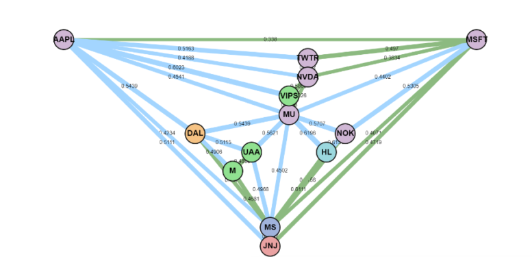
A planar graph is a graph which can be drawn on a flat surface without the edges crossing. The Planar Maximally Filtered Graph (PMFG) is a planar graph where the edges connecting the most similar elements are added first (Tumminello et al, 2005). For example, for a correlation-based PMFG, the edges with the highest correlation would be added first. The steps to construct the PMFG are defined as follows:
- Order the edges from the highest similarity to the lowest.
- Add the edge with the highest similarity to the PMFG, if the resulting graph is planar
- Keep adding edges from the ordered list, until
 edges have been added.
The PMFG retains the Minimum Spanning Tree (MST) as a subgraph, thus it retains more information about the network than a MST (Tumminello et al, 2005).
An example PMFG, where the MST edges are shown in green.
Comparing the Impact of Covid-19
Pozzi, Di Matteo, and Aste (2013) conclude that it is “better to invest in the peripheries” of the PMFG, as it leads to better returns and reduced risk. By taking 92 stocks and indexes, the aim was to understand how the “peripheral” stocks would perform, compared to the “central” stocks during the drastic decline and recovery. For stocks, various sectors were included such as Energy, Consumer Defensive, Industrial, Healthcare, Finance, Technology amongst others. ETFs and REITs were also included in the dataset. This section closely follows the method presented by Pozzi, Di Matteo, and Aste (2013).
Firstly, the nodes are ranked according to the centrality, to create a list of the 𝑚 most peripheral stocks and the 𝑚 most central stocks. Secondly, the peripheral and central portfolios are compared to simulate how these portfolios would behave, had the investments been made just before the aggressive decline in mid-February. Thus, we can split this section into two parts:
- Portfolio Selection pre-covid decline (from 20th September 2019 until the 15th of February 2020).
- Performance Analysis comparison (from 16th of February until 20th of September 2020)
Portfolio Selection using PMFG
A list of 92 stocks daily closing prices were downloaded from Yahoo Finance (https://finance.yahoo.com/) between the period 20th of September 2019 until 15th of February 2020 to inform the selection process.
The correlation matrix heatmap of the stocks daily log returns is shown.
Selection by Centrality Ranking
A hybrid centrality measure proposed by Pozzi, Di Matteo and Aste (2013) is given by X + Y.
\begin{aligned} X = \frac{C_{D}^w + C_{D}^u + C_{BC}^w+ C_{BC}^u – 4}{4 * (N-1)} \end{aligned}
\begin{aligned} Y = \frac{C_{E}^w + C_{E}^u + C_{C}^w + C_{C}^u + C_{EC}^w + C_{EC}^u- 6}{6 * (N-1)} \end{aligned}
Where Degree (D), Betweenness Centrality (BC), the Eccentricity (E), the Closeness (C) and the Eigenvector Centrality (EC) for both weighted ![]() and unweighted graphs
and unweighted graphs ![]() . The nodes are ranked according to X + Y.
. The nodes are ranked according to X + Y.
However, the authors state that this hybrid measure was used as it gave the best performances for the results of the paper, and that the peripheral nodes consistently perform better than central nodes “for all centrality measures”. Thus, we use a variation of centrality measures from NetworkX’s library to create the ranking of nodes.
\begin{aligned} ranking = \sum{(C_{D}^w + C_{D}^u + C_{BC}^w+ C_{BC}^u + C_{E}^u + C_{C}^w + C_{C}^u – \frac{C_{SO}^w}{100} – C_{EC}^u)} \end{aligned}
The factors included are: Degree (D), Betweenness Centrality (BC), Eccentricity (E), Closeness Centrality (C), Second Order Centrality (SO) and Eigenvector Centrality (EC). The Second Order Centrality (SO) is divided, as the output values would have a disproportionately large impact on the ranking.
from mlfinlab.networks.visualisations import generate_central_peripheral_ranking

# Create distance based PMFG
distance_matrix = np.sqrt(2 * (1 - correlation_matrix))
pmfg_dist = PMFG(distance_matrix, "distance")
pmfg_graph_distance = pmfg_dist.get_graph()

ranked_nodes = generate_central_peripheral_ranking(pmfg_graph_distance)
The resulting list shows the ranking of the nodes. The smaller the value, the more peripheral the node. The larger the value, the more central the node.
- Ranking
- 0
- 1
- 2
- 3
- 4
- …
- 87
- 88
- 89
- 90
- 91
- Ranking
- -7.746241
- -7.373012
- -6.852654
- -6.666342
- -6.512487
- …
- 24.020946
- 25.958717
- 26.365954
- 27.315073
- 36.252276
- node
- DHI
- DD
- GE
- EXPD
- EIX
- …
- FLS
- FITB
- ETN
- CMI
- EMR
From the ranking, we can slice the top 10 stocks, and the bottom 10 stocks from the list.
['DHI', 'DD', 'GE', 'EXPD', 'EIX', 'EBAY', 'EXC', 'XRAY', 'EXPE', 'DISCA']
['FLIR', 'HP', 'DVN', 'FE', 'ECL', 'FLS', 'FITB', 'ETN', 'CMI', 'EMR']
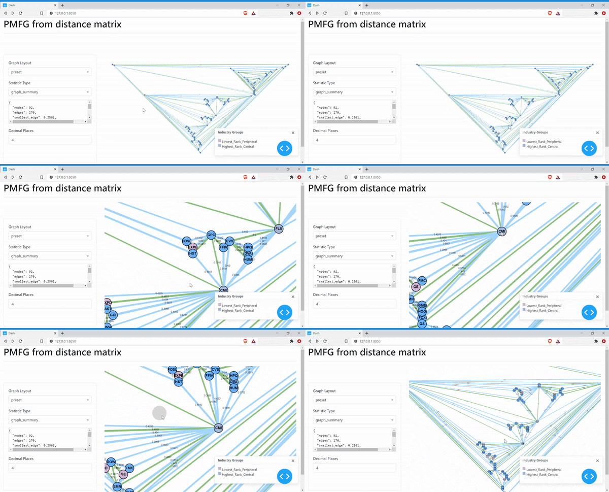
Next, we can create the visualisation of the PMFG, with different colours denoting the peripheral nodes and the central nodes.
# Define the colours to show the different ranked nodes.
colours = {
'lowest_rank_peripheral' : lowest_rank_peripheral,
'highest_rank_central' : highest_rank_central
}

# Generate PMFG visualisation server
server = generate_pmfg_server(log_ret_pre_decline, input_type="distance",  colours=colours)
server.run_server()
The PMFG shows the most central stocks with the highest rank values having the most connections to the other nodes in the graph. The peripheral stocks with the lowest rank commonly have only two neighbours. The Minimum Spanning Tree is shown in the PMFG using the green edges. However, since it is difficult to see the MST, we can create a separate MST graph to view this.
server = generate_mst_server(log_ret_pre_decline, jupyter=True, colours=colours)
server.run_server()
Similar to the PMFG, the peripheral nodes are usually at the end of the MST, whereas the central nodes connect the different branches of the MST.
Analysis of Performance
The performances of the two portfolios are compared from the 16th of February 2020 until the 20th of September 2020. This simulates an investment made right before the dramatic drop in the market. By analysing this period, the aim is to understand whether picking peripheral stocks creates a more robust portfolio during an unexpected crisis like the Covid-19 pandemic.
Cumulative Returns
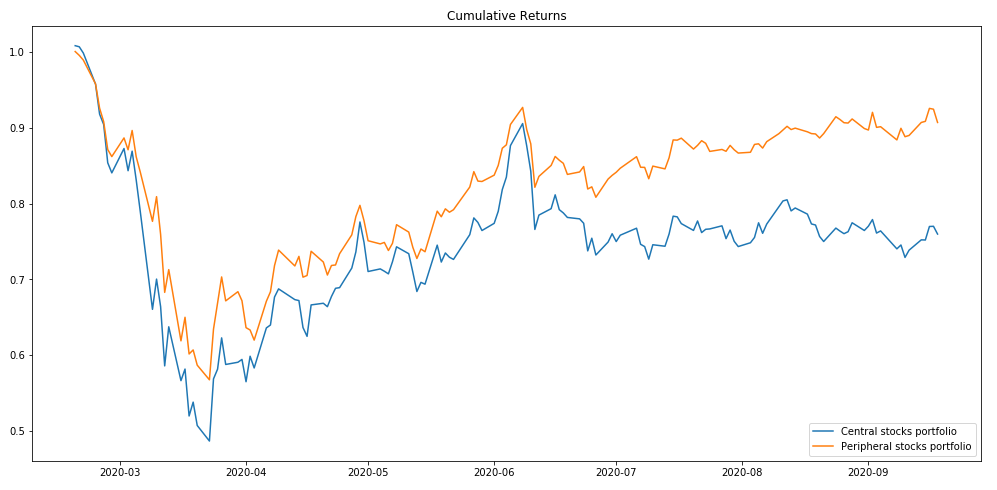
The cumulative returns of peripheral and central portfolios.
The cumulative returns plot shows that the peripheral portfolio stocks outperformed the central stocks portfolio. The peripheral portfolio recovers to 90.7% of its original value, whereas the central portfolio recovers to 76% of its original value (to 3 significant figures). The trough of both of the cumulative returns shows that the central stocks portfolio dropped 8% further than the peripheral portfolio.
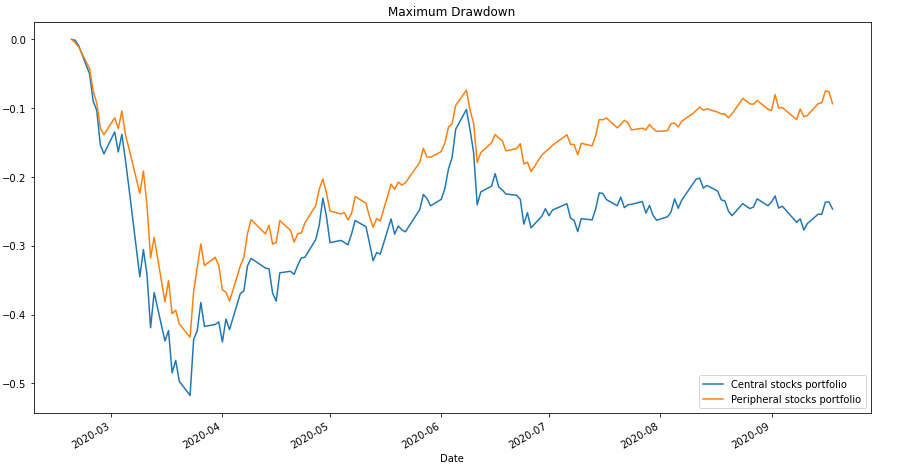
We can compare the maximum drawdown, Sharpe Ratio, and the volatility for a further performance comparison.
Maximum Drawdown
Maximum drawdown for peripheral versus central portfolio.
Rolling Sharpe Ratio
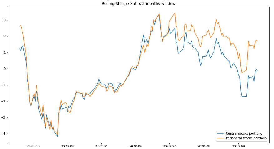
The Rolling Sharpe Ratio with a 3 month window.
The plot shows that the central stocks portfolio and peripheral stocks portfolio have very similar Sharpe ratios until around late June. From July until the 20th of September, we see the Sharpe ratios diverging significantly, where the peripheral stock portfolios have a higher Sharpe Ratio.
Rolling Volatility
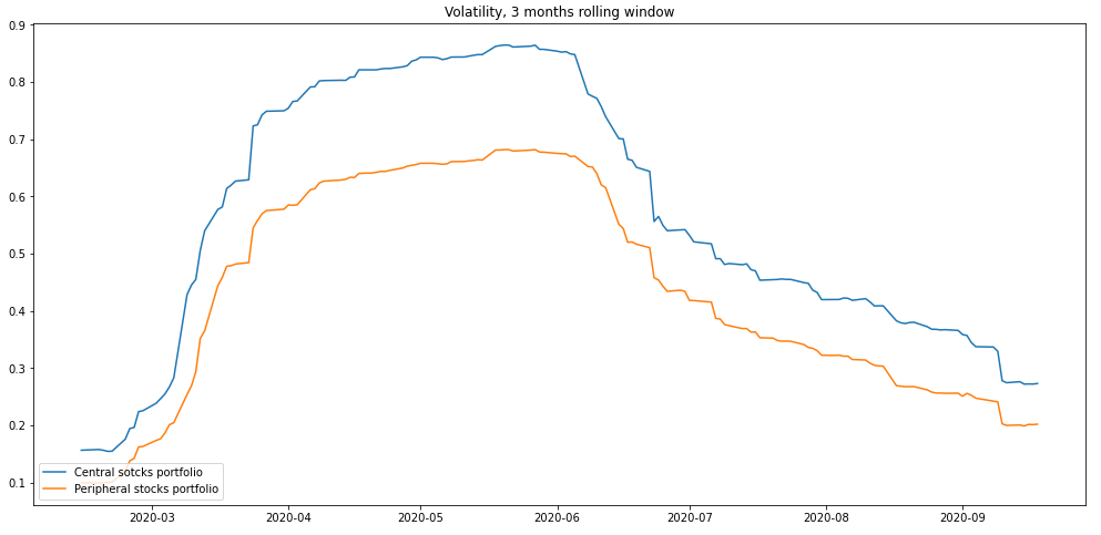
The rolling volatility of the peripheral portfolio is consistently lower throughout the period. Since the values are calculated on a 3 months rolling window, the greatest volatility gap between the portfolios is shown during April 2020 until June 2020, to reflect on the high volatility time period of February 2020 until May 2020.
Conclusion
Neither the peripheral portfolio nor the central stocks portfolio recovered to their initial values before the drop in the market. However, the peripheral stocks portfolio significantly outperformed the central stocks portfolio. While the central stocks portfolio value remained mostly flat (from late June until late September), the peripheral stocks portfolio continued to recover. This was reflected in the Rolling Sharpe Ratio, where the portfolio ratios diverged noticeably towards the end of the period. The peripheral portfolio recovered to 90.7% of its original value, whereas the central portfolio recovered to 76% of its original value by the 20th of September 2020.
It is evident that the peripheral portfolio is exposed to less systemic risk. The peripheral portfolio dropped 8% less than the central stocks portfolio. The volatility is consistently lower for the peripheral stocks. This suggests that the portfolio consisting of peripheral stocks are more shock resistant than the portfolio consisting of central stocks. The analysis of the performances suggests that the peripheral stocks portfolio is less risky, recovers more swifty, and is more Covid-19 robust.
References
- Tumminello, M., Aste, T., Di Matteo, T. and Mantegna, R.N., 2005. A tool for filtering information in complex systems. Proceedings of the National Academy of Sciences, 102(30), pp.10421-10426. https://arxiv.org/pdf/cond-mat/0501335.pdf
- Pozzi, F., Di Matteo, T. and Aste, T., 2013. Spread of risk across financial markets: better to invest in the peripheries. Scientific reports, 3, p.1665. https://www.nature.com/articles/srep01665

