
by Michael Meyer and Masimba Gonah
Introduction
Trading in financial markets can be a challenging and complex endeavour, with ever-changing conditions and numerous factors to consider. With markets becoming increasingly competitive all the time, it is a never ending struggle to stay ahead of the curve. Machine learning (ML) has made several advances in recent years, particularly by becoming more accessible. One might think then why not use ML models in markets to challenge more traditional ways of trading? Well the answer is, unfortunately, that it is not so simple.
Financial time series can be challenging to model due to a number of undesirable characteristics that are commonly observed in these series. These characteristics include:
- Overfitting: There is a multitude of features that can be used in financial modelling, and it can be difficult to determine which of these features are truly predictive of future behaviour. This can lead to overfitting, where a model performs well on the training data but poorly on the test data (and on real-world data once deployed!).
- Non-stationarity: Financial time series often exhibit non-stationarity, which means that the statistical properties of the series change over time. This can make it difficult to model the series using traditional techniques such as linear regression, which assume stationarity in the data.
- Heteroscedasticity: Financial time series often display heteroscedasticity, which means that the variance of the series changes over time. This can make it difficult to estimate the true variance of the series and can lead to biased estimates of model parameters.
- Autocorrelation: Financial time series often exhibit autocorrelation, which means that the value of the series at one point in time is correlated with the value of itself at another point in time. This can make it difficult to model the series using techniques that assume independence, such as linear regression.
To overcome these challenges, ML models for financial time series should be designed to account for these characteristics, either in the model itself or by transforming the data. For example, we can use ML techniques that are robust to non-stationarity and autocorrelation, by incorporating regularization to reduce overfitting, or by using techniques that account for heteroscedasticity, such as generalized autoregressive conditional heteroscedasticity (GARCH) models.
In this post we’ll take a deep dive into various key aspects of machine learning in trading to overcome some of these challenges. This post is the first in a series. In parts 1 and 2, we will investigate techniques to process data in a suitable manner before feeding it into an ML model. The aim is to get a good understanding of some of the most fundamental concepts, so that an ML model can make sense of the data and extract useful information. Today, we’ll tackle the problem of financial data structures, and see if we can utilize other structures apart from your typical time bars to improve the performance of an ML model.
The concepts are guided by the book Advances in Financial Machine Learning written by Professor Marcos Lopez de Prado . We’ll also introduce you to MLFinLab, our in-house Python package that makes it easy to apply these techniques in your quantitative research and trading.
To get off the ground quickly, we’ll also be partnering with QuantConnect, a platform that offers a wealth of resources for traders of all levels. Whether you’re new to ML or a seasoned pro, this article will give you a step-by-step guide to some of the most fundamental concepts for ML trading.
Overview
To create a robust machine learning trading strategy we’ll follow a set of key steps that help to improve our analysis. To start off, we’ll explore the following concepts:
- Financial Data Structures: Instead of relying on traditional time bars, we will investigate dollar bars to structure our financial data. By grouping transactions together based on a fixed dollar amount, we can reduce noise in the data and enhance our ability to identify meaningful patterns.
- Fractional differentiation: Applying fractional differentiation can help us transform our financial time series data into a stationary series, which can make it easier to identify trends and signals. By removing drift from the data, we can effectively analyse the underlying patterns, which helps us to make better trading decisions.
- CUSUM filter: Filters are used to filter events based on some kind of trigger. We will apply a symmetric CUSUM filter, to detect significant changes in the trend of our financial time series. This filter tracks the cumulative sum of the differences between the expected and observed values, which helps to identify turning points in the trend that may signal buying or selling opportunities.
- Triple barrier labelling: Triple barrier labelling allows us to define profit-taking and stop-loss levels for each trade, as well as when not to initiate a trade. By setting upper and lower profit-taking barriers and a stop-loss barrier based on asset volatility, we can automatically exit trades when certain conditions are met.
In part 1 of the article we cover financial data structures.
We will be working in a QuantConnect research node, along with our powerful MLFinLab package. If you’d like to follow along, create a QuantConnect account (there is a free subscription option). You will also need an active subscription to MLFinlab.


Getting started
Let’s dive in!
To start, let’s import the data and transform it into usable format:
# QC construct
qb = QuantBook()

# Specify starting and end times
start_time = datetime(2010, 1, 1)
end_time = datetime(2019, 1, 1 )

# Canonical symbol
es = qb.AddFuture(Futures.Indices.SP500EMini).Symbol

# Continuous future
history = qb.History(es, start_time, end_time, Resolution.Minute, dataNormalizationMode = DataNormalizationMode.BackwardsPanamaCanal)
history = history.droplevel([0, 1], axis=0)  # drop expiry and symbol index, useless in continuous future

data = history
data['date_time'] = data.index
data['price'] = data['close']
data = data[['date_time','price','volume]]
In the code snippet above, we request historical data for S&P 500 E-mini futures contracts. This is a simple process using LEAN, which is QuantConnect’s opensource algorithmic trading engine. The data is freely available on their website to use and you can even download LEAN locally! The contracts are backwards adjusted for the roll, based on the front-month, in order to stitch the contracts together and have a single time series.
We request data from 2010-2018 in minute bars that we will use in our initial analysis. We could’ve also chosen a higher sampling frequency (eg. seconds or even raw ticks), but the computational cost increases significantly as we sample more frequently, so we’ll stick to minute bars.

Financial Data Structures
We will first investigate the different data structures and see what statistical properties they hold, before deciding on an appropriate structure to use.
There are several types of financial data structures, including time bars, tick bars, volume bars, and dollar bars.
- Time bars are based on a predefined time interval, such as one minute or one hour. Each bar represents the trading activity that occurred within that time interval. For example, a one-minute time bar would show the opening price, closing price, high, and low within one-minute.
- Tick bars are based on the number of trades that occur. Each bar represents a specified number of trades. For example, a 100-tick bar would show the opening price, closing price, high, and low for the 100 trades that occurred within that bar.
- Volume bars are based on the total volume of shares traded. Each bar represents a specified volume of shares traded. For example, a 10,000-share volume bar would show the opening price, closing price, high, and low for all trades that occurred until the total volume traded reaches 10,000.
- Dollar bars are based on the total dollar value of the shares traded. Each bar represents a specified dollar value of shares traded. For example, a $10,000 dollar bar would show the opening price, closing price, high, and low for all trades that occurred until the total dollar value of shares traded reaches $10,000.
Tick bars sample bars more frequently when more trades are executed, while volume bars sample bars more frequently when more volume is traded. While tick bars may be influenced by repetitive or manipulative trades, volume bars bypass this issue by only caring about the total volume traded. However, volume bars may not be effective indicators the value of the asset is fluctuating. To address this, dollar bars can be used instead, which measures the quantity of fiat value exchanged rather than the number of assets exchanged.
To illustrate this concept let’s take a simple example. When someone want to invest they usually decide on a dollar amount to invest, for example investing $10,000 in Apple. The quantity of shares would then be calculated in order to invest that amount. Let’s say you want to invest $10,000 in Apple shares at $100 a share. Then you would buy 100 shares. If the price changes to $200 and you would like to invest the same amount, then you would only buy 50 shares. This examples illustrates that the volume traded is dependant on the price and would not be as consistent as the dollar amount exchanged, which would be the same in both scenarios.
As a result, dollar bars are typically considered more informative than other types of bars, as they provide a more “complete” representation of market activity and can capture periods of high volatility more effectively. A key advantages of dollar bars is that they help to reduce the impact of noise in financial data. In contrast, time-based bars can be affected by periods of low trading activity or market closure, which can result in missing or inaccurate signals. Since dollar bars are constructed based on actual trading activity, they are less susceptible to this type of noise.
But this begs the question: what should the threshold dollar amount exchanged be to form a new dollar bar? When we tried to find an answer, we were surprised to find that very little information exists on this question. Every analysis that we have seen simply uses a constant threshold with no clear explanation to how they derived the threshold amount used.
One suggestion comes Prof. Lopez de Prado who notes that bar size could be adjusted dynamically as a function of the free-floating market capitalisation of a company (in the case of stocks), or the outstanding amount of issued debt (in the case of fixed-income securities). We assume the reason for this is to normalize the amount of money being exchanged by controlling for the total amount of money that could be exchanged, but this is a vague proposition at best and the reason is not quite clear as to why this will improve performance. Sure, the free float market capitalisation is inversely related to volatility, but it is not readily apparent how to make use of this relationship. He also notes that the best statistical properties occur when you sample more or less 50 times a day (meaning you form 50 dollar bars a day), but this is likely an empirical observation.
So to answer this question let’s first think about why we want to use dollar bars. We want to sample on equal buckets of market activity, which is a proxy for equal samples of information. If that is the case, the when should have a sample rate that reflects this activity. Another consideration is the ultimate strategy we want to deploy. If, for example, we have higher frequency trading strategy then we would want to have more granular data and therefore have a higher sampling frequency.
Say we use a constant threshold to form dollar bars. If the fiat value exchanged increase over time (which it most likely will due to inflation for example, or a security becoming more popular to trade) we will on average under sample closer to the start and over sample towards the end over the period we are forming the bars (provided a long enough timespan).
To illustrate this point, let’s look at the volume and dollar amount exchanged over time.
First we will construct time bars using our package MLFinLab. Hudson & Thames has it’s own selectable development environment in QuantConnect, and to use it you only require your API key, which you obtain on purchase. To authenticate MLFinlab on QuantConnect, execute the two lines show below:
import ht_auth
ht_auth.SetToken("YOUR-API-KEY")
Then we can create daily time bars which we will use in our analysis:
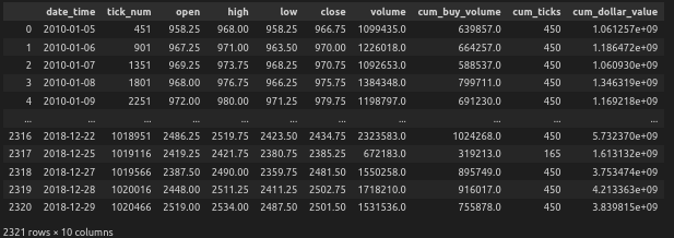
# create daily bars
time_bars_daily = time_data_structures.get_time_bars(data, resolution='D', verbose=False)
time_bars_daily.index =  time_bars_daily['date_time']
time_bars_daily
This produces the following output:
Next let’s, take a look at the volume and dollar amounts exchanged over time:
fig, axs = plt.subplots(2, 2, figsize=(12, 12))


monthly_data_volume = time_bars_daily['volume'].resample('M').mean()
monthly_data_dollar = time_bars_daily['cum_dollar_value'].resample('M').mean()

# First subplot: yearly_avg_volume with 12-month rolling window
ax1 = axs[0, 0]
color = '#0C9AAC'
ax1.set_xlabel('Year')
ax1.set_ylabel('Average Volume per day', color=color)
ax1.bar(monthly_data_volume.index, monthly_data_volume.rolling(window=12).mean(), width=30, color=color)
#ax1.tick_params(axis='y', labelcolor=color)
ax1.set_title('Daily Average Volume (12-month window)')

# Second subplot: monthly_data_volume with 1-month rolling window
ax2 = axs[0, 1]
color = '#0C9AAC'
ax2.set_xlabel('Month')
ax2.set_ylabel('Average Volume per day', color=color)
ax2.bar(monthly_data_volume.index, monthly_data_volume.rolling(window=1).mean(), width=30, color=color)
#ax2.tick_params(axis='y', labelcolor=color)
ax2.set_title('Daily Average Volume (1-month window)')

# Third subplot: yearly_avg_dollar with 12-month rolling window
ax3 = axs[1, 0]
color = '#DE612F'
ax3.set_xlabel('Year')
ax3.set_ylabel('Average Dollar amount per day', color=color)
ax3.bar(monthly_data_dollar.index, monthly_data_dollar.rolling(window=12).mean(), width=30, color=color)
#ax3.tick_params(axis='y', labelcolor=color)

ax3.set_title('Daily Average Dollar (12-month window)')

# Fourth subplot: monthly_data_dollar with 1-month rolling window
ax4 = axs[1, 1]
color = '#DE612F'
ax4.set_xlabel('Month')
ax4.set_ylabel('Average Dollar amount per day', color=color)
ax4.bar(monthly_data_dollar.index, monthly_data_dollar.rolling(window=1).mean(), width=30, color=color)
#ax4.tick_params(axis='y', labelcolor=color)
ax4.set_title('Daily Average Dollar (1-month window)')

# Adjust layout and spacing between subplots
plt.tight_layout()
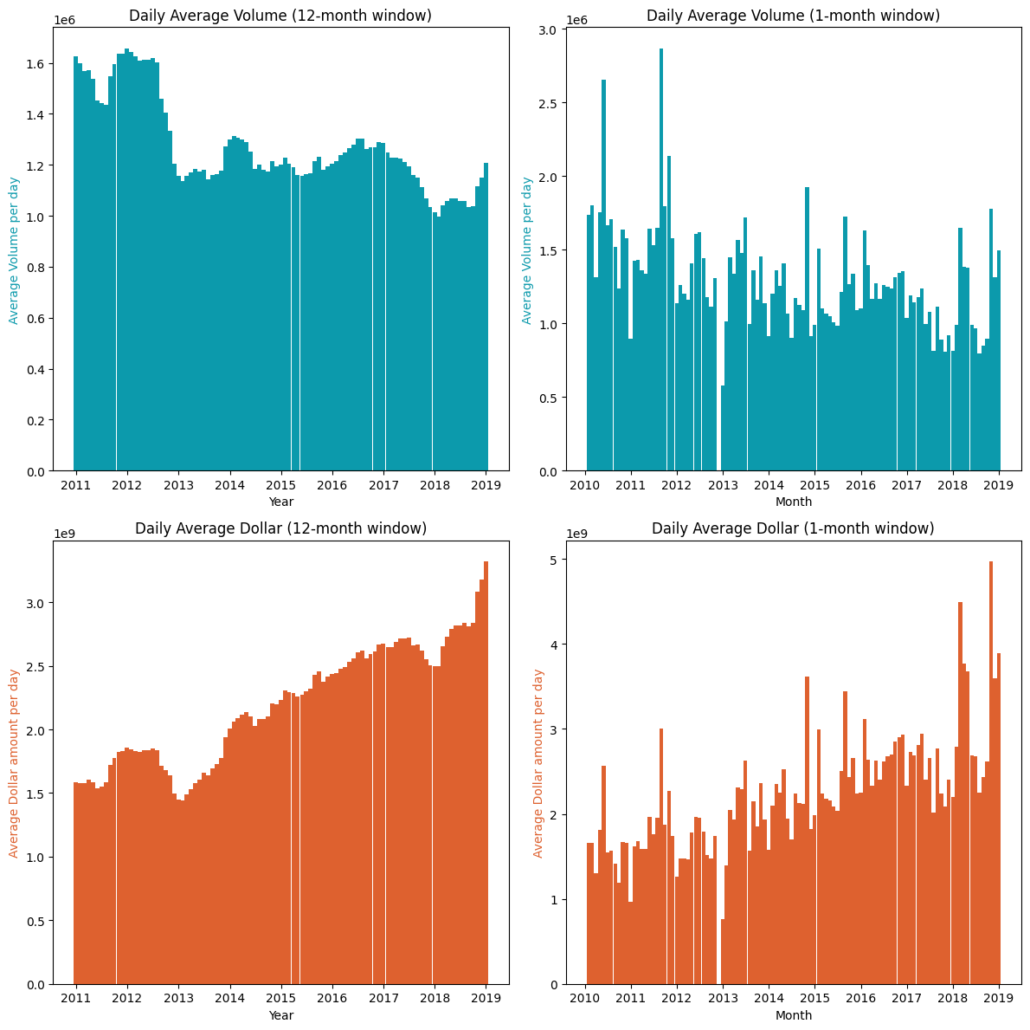
The graphs above displays the average daily average volume and dollar amounts exchanged. The left-hand side uses a rolling window of 12-month and the right-hand side uses rolling window of 1-months to calculate the average daily amount. On a month-to-month basis the amounts fluctuate quite a lot. We can clearly see a trend when using a longer window for both volume and dollar amounts. The volume is decreasing over time while the dollar amount is increasing, which isn’t all that surprising since the price of SPY has increased significantly over the period. Therefore it would make more sense to apply a dynamic threshold.
Another possible reason for using a dynamic threshold is as follows: a known useful feature to use in many strategies is to incorporate the volume traded on a security. If we use dollar bars however, incorporating volume is redundant as the only differential is the price. We can however use the rate of information used to form a bar, for example the time it took to form the bar, or the number of ticks in a bar. If we use a constant threshold over our sampling period, the average rate of information at the start of the period will be slower than toward the end, since we will sample at a different rate, making it non-stationary. Therefore a dynamic threshold would also be more appropriate to use in this case.
We will apply a dynamic threshold on a monthly basis, based on the average daily amount exchanged calculated over the previous year using a 12-month rolling window, as it provides more consistent results. Therefore, every month we update the amount that needs to be crossed in order to form a new bar. However, for backtesting purposes, it may be better to use the average calculated over the testing period. In a live trading setting, the approach described previously can be used.
For this example, we use a sample frequency of 20, but this should be dependent on the strategy being deployed. In our case 20 will be sufficient to conduct our analysis, while keeping computational costs in mind.
To obtain the thresholds, we divide the average amount traded per day by the sample frequency. This results in a series of thresholds that we use to update the amounts.
# calculate the daily average amounts exchanged
daily_avg_volume = monthly_data_volume.rolling(window=12).mean()
daily_avg_dollar = monthly_data_dollar.rolling(window=12).mean()

# the average amount we want to sample from
sample_frequency = 20

# the thresholds (which is series) of amounts that need to be crossed before a new bars is formed based on the times we want to sample per day
volume_threshold = daily_avg_volume / sample_frequency
dollar_threshold = daily_avg_dollar / sample_frequency

dollar_bars = standard_data_structures.get_dollar_bars(data['2011':], threshold=dollar_threshold,
                                                  batch_size=10000, verbose=True)
volume_bars = standard_data_structures.get_volume_bars(data['2011':], threshold=volume_threshold,
                                                  batch_size=10000, verbose=True)
Let’s look at the results from the dollar bars.
Additionally, in our analysis, we will include time bars, where we also want to sample 20 times per day. To ensure a fair comparison, we calculate the sample period as follows: 7.5 hours (open market hours) * 60 minutes / 20 = 22.5 minutes
time_bars = time_data_structures.get_time_bars(data, resolution='MIN',num_units=22, verbose=False)
Testing for partial return to normality
The Jarque-Bera test is a goodness-of-fit test that tests whether the data has the skewness and kurtosis matching a normal distribution. It is commonly used to test the normality assumption of the residuals in regression analysis. The test statistic is calculated as the product of the sample size and the sample skewness and kurtosis.
The Shapiro-Wilk test is another commonly used test for normality. It tests whether the data is normally distributed by comparing the observed distribution to the expected distribution of a normal distribution. The test statistic is calculated as the sum of the squared differences between the observed values and the expected values under the assumption of normality.
Both tests are used to determine whether a given dataset can be assumed to have been drawn from a normal distribution. However, the Shapiro-Wilk test is generally considered more powerful than the Jarque-Bera test, particularly for smaller sample sizes. Additionally, the Jarque-Bera test only tests for skewness and kurtosis, while the Shapiro-Wilk test takes into account the entire distribution.
Both tests should be used in conjunction with other diagnostic tools to fully assess the normality assumption of a dataset.
The following code calculates both statistics:
from scipy import stats
from scipy.stats import jarque_bera

# Calculate log returns
time_returns = np.log(time_bars['close']).diff().dropna()
volume_returns = np.log(volume_bars['close']).diff().dropna()
dollar_returns = np.log(dollar_bars['close']).diff().dropna()

print('Jarque-Bera Test Statistics:')
print('Time:', 't', int(stats.jarque_bera(time_returns)[0]))
print('Volume: ', int(stats.jarque_bera(volume_returns)[0]))
print('Dollar: ', int(stats.jarque_bera(dollar_returns)[0]))
print('')

# Test for normality
shapiro_test_time_returns = stats.shapiro(time_returns)
shapiro_test_volume_returns = stats.shapiro(volume_returns)
shapiro_test_dollar_returns = stats.shapiro(dollar_returns)

print('-'*40)
print(' ')
print('Shapiro-Wilk Test')
print("Shapiro W for time returns is {0}".format(shapiro_test_time_returns.statistic))
print("Shapiro W for volume returns is {0}".format(shapiro_test_volume_returns.statistic))
print("Shapiro W for dollar returns is {0}".format(shapiro_test_dollar_returns.statistic))
The output is:
Jarque-Bera Test Statistics:
Time: 	 15533322
Volume:  5648369
Dollar:  11270307

------------------------------

Shapiro-Wilk Test Statistics:
Time: 0.75
Volume: 0.828
Dollar: 0.815
The lower the Jarque-Bera test statistic, the closer the returns are to being normally distributed. We see that time bars are the highest and volume bars is the lowest is this case, while dollar bars are in between. Since the Jarque-Bera tests for only for skewness and kurtosis, the volume bars interestingly enough are the closest to having a skewness and kurtosis of a normal distribution.
For the Shapiro-Wilk test, the closer the test-statistic is to 1, the closer it is to being normally distributed. We again observe that both volume and dollar bars show an improvement from time bars.
Let us also do a visual inspection to sanity-check our results:
# Standardize the data
time_standard = (time_returns - time_returns.mean()) / time_returns.std()
volume_standard = (volume_returns - volume_returns.mean()) / volume_returns.std()
dollar_standard = (dollar_returns - dollar_returns.mean()) / dollar_returns.std()

# Plot the Distributions
plt.figure(figsize=(16,12))
sns.kdeplot(time_standard, label="Time", color='#949494',gridsize = 3000)
sns.kdeplot(volume_standard, label="Volume", color='#0C9AAC',gridsize = 3000)
sns.kdeplot(dollar_standard, label="Dollar", linewidth=2, color='#DE612F',gridsize = 3000)
sns.kdeplot(np.random.normal(size=1000000), label="Normal", color='#0B0D13', linestyle="--")

#plt.xticks(range(-5, 6))
plt.legend(loc=8, ncol=5)
plt.title('Partial recovery of normality through a price sampling process nsubordinated to a time, volume, dollar clock',
          loc='center', fontsize=20, fontweight="bold", fontname="Zapf Humanist Regular")
plt.xlim(-5, 5)
plt.show()
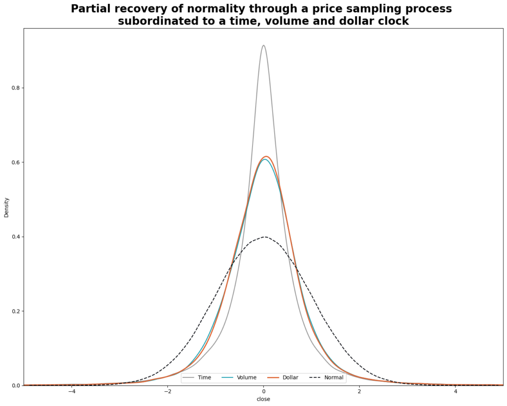
Look’s great! Clearly form this graph we can see the volume and dollar bars are much closer to being normally distributed than time bars.
Conclusion
To conclude part 1, we delved into the distinctive features of various financial data structures, including time, tick, volume, and dollar bars. Based on our analysis, we discovered that volume bars offer the best statistical properties, closely followed by dollar bars. Dollar bars however have a more intuitive appeal and therefore we have decided to use them as our data structure in the subsequent part of the article where we will continue to process the data for our ML model.
Coming up in Part 2
In our next post in the series, we’ll take a look at a technique to make a time series stationary while preserving as much memory as possible. We’ll also tackle how to filter for events so that we know when to trade, and how to label our target variable. Stayed tuned for the follow up post to find out more!


Trackbacks & Pingbacks
[…] enjoying our journey towards building a successful machine learning trading strategy. If you missed Part 1 of our series, don’t fret – you can always catch up on our exploration of various […]
[…] Machine Learning Trading Essentials (Part 1): Financial Data Structures [Hudson and Thames] […]
Comments are closed.